Master font pairing for eye-catching designs — perfect for students in animation and graphic design.
Introduction
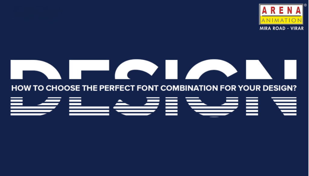
A beginner’s guide to making your designs look awesome with the right fonts
Fonts play a very important role in design. Whether you are into animation, video editing, or graphic design, the fonts you use can change how people feel about your design. It doesn’t matter if you are learning through animation classes, VFX classes, motion classes, or even taking a graphic designing class—knowing which fonts to use together is a skill every designer must learn.
Let’s break it down in simple words, just like how we talk every day.
Why Font Combinations Matter
Imagine reading a cool movie poster that uses a scary font for a comedy film—odd, right? Fonts talk. They give your design a feel. That’s why using the right font combo is so important. For example, one font might feel serious, and the other might feel fun. Putting them together properly can balance your whole design.
If you’re studying at any animation course in Virar or animation course in Mira Road, you’ll definitely come across design basics. Choosing fonts is one of them!
How to Choose the Best Font Combinations?
Let’s answer this in a few easy Q&A style points:
Q: Can I use any fonts together?
A: You can, but not all of them will look good together. It’s like mixing mango and pickle—doesn’t always work! Try to pick one bold font and one simple font. This keeps your design clean and easy to read.
Q: What’s a safe font combo to start with?
A: Use a serif font (like Times New Roman) with a sans-serif font (like Arial). Serif fonts have little lines at the ends, sans-serif ones don’t. They balance each other nicely.
Q: Should both fonts look similar?
A: Not really. If fonts look too similar, the design feels boring. Mix contrast, but don’t overdo it. Think of them like a cricket team—each player has a role, but they work together.
Font Pairing Tips for Students
If you’re studying in any graphic design in Mira Road or graphic design in Virar, or enrolled in a motion course in Mira Road, you’ll hear these tips often:
- Use contrast: A big title font with a small readable font looks neat.
- Don’t use more than 2 fonts: Too many fonts look messy.
- Think about mood: A playful design? Use round, soft fonts. Serious one? Go for sharp, straight fonts.
Whether you are learning video editing course in Mira Road, VFX class in Mira Road, or video editing course in Virar, remember—good design starts with good font choices!
What Tools Can Help You Pick Fonts?
Here are a few websites that help you find great font combos:
- Google Fonts
- Fontpair
- Canva Font Combinations
- Typ.io
These are super helpful, especially if you’re just starting out with graphic designing classes, motion classes, or even a VFX class in Virar.
Why Should You Care About Fonts?
Fonts might seem small, but they are a big deal. If your design doesn’t look readable or if it doesn’t give the right vibe, people might ignore it—even if you’ve used great animations or graphics.
Even students who are into animation classes, motion course in Virar, or looking for the best institute for graphic design in Virar or Mira Road need to understand fonts. It’s a skill that adds polish to your final work.
Closing Thoughts: Fonts Speak Louder Than Words
Picking the best font combinations is like finding the right background music for a scene. It sets the mood, makes your design clear, and gives your project a professional touch. Whether you’re just starting out or already learning from a video editing course in Virar or a VFX class in Mira Road, this small skill will make a big difference in your work.
Start experimenting with fonts. Use the tools above. Keep it clean, simple, and smart.
Stay Connected With Us:
Our Social Media Links:
🔗 Instagram: @arenaanimation_mv
🔗 Facebook: Arena Animation Mira Road & Virar
🔗 Twitter: @VirarArena
🔗 YouTube: Arena Animation Virar
🔗 LinkedIn: Arena Animation Mira Road & Virar
📚 Read More Blogs:
Visit www.arenavirar.com/blog for more useful design tips and career advice.
Fonts Can Make or Break Your Design—Choose Wisely!